Form into Flatness into Form: The Shape-Sifting of Diane Simpson
As incontrovertible as it is that our world exists in three physical dimensions, our social and cultural worlds communicate largely through two-dimensional imagery. Whether in the form of the printed page, or images on video or movie screens, or manifestations from snapshots to signs and billboards to diagrams to slides (traditional or PowerPoint), two-dimensional representations are everywhere. Navigating the world necessitates constant translation of the two-dimensional into three, from interpreting photographs to translating GPS maps so that one might maneuver a car through the real environment.
The translation of the flat into a volume has long been an activity of artists, especially as the twentieth century unfolded with sculptural investigations of innovators such as the Constructivists like Tatlin, or Alexander Calder, Jean Arp, David Smith, and many others. In the more recent history of contemporary art, a noticeable tendency has been the celebration of the flat precisely because of the ubiquity of two-dimensional representations that make up our world. From the 'Superflat' philosophy of Takashi Murakami to the cut-outs of Julian Opie, forms are simplified, even abstracted, but in a cartoonish or even childlike way, to create pleasing imagery. Most viewers can easily recognize the translational process of two dimensions into three. As exemplified by Roy Lichtenstein's three-dimensional—but essentially planar— house sculptures, the final works have clear and unmistakable connections to their two-dimensional sources.
Diane Simpson has long been on this aesthetic playing-field. Yet Simpson takes this process of translating from two dimensions into three a further step. She starts with volumetric objects from the world, translates them into two dimensions by means of elegant and intricate drawings (essentially plans for the sculptures), and then creates a volumetric object as the final work. And in the process of translation between dimensional manifestations, it might be said she is a 'shape- sifter,' for Simpson sifts through a wide range of sources—the contours of a thatched roof, the folds of leather that make up tool belts, the shapes traced by the delicate laces and fabrics of traditional bonnets—to seize upon her essential forms. In examining one of Simpson's sources, it is obvious that the forms of the sculpture which it inspired reside there. Yet, without the artist having seized upon and translated those forms, it is doubtful any viewer would look at, say a vintage dress mannequin, and notice the articulation of forms this utilitarian item carries in it in any way nears the graceful flow of lines that make up Apron V of 2002.
Simpson's career now spans three decades, yet has had a formal consistency that allows one both to learn and appreciate her process while greatly enjoying its iterations, which, as witnessed by this current exhibition, are ceaselessly captivating and satisfying. In understanding this progression, it is helpful to go back to an early 'inspirational image' for the artist, The Shrine at Medina, made in Ottoman Turkey in the late 17th to early 18th century. This painting shows a bird's-eye view of the walled complex, but flattened into planes strange and awkward to the Western eye, formed as it has been by classical one-point perspective. In today's parlance, this type of rendering is called isometric drawing, a type of graphic representation that takes the form of axonometric projection, a method of visually representing three-dimensional objects in two dimensions in which the three coordinate axes appear equally foreshortened and the angles between any two of them are 120 degrees. This sort of projection or drawing technique is most commonly used in engineering and technical drawings.

"The Shrine At Medina",
late 17th-18thcentury, Ottoman Art
At the School of the Art Institute of Chicago where she received both her BFA and MFA, Simpson studied painting, drawing, and printmaking. Her final year of graduate school in the painting department found her producing not paintings, but drawings and prints using isometric perspective, which naturally led to suggestions that she construct the two-dimensional representations. To this day pencil and paper remain key tools for the working out of forms to translate into three dimensions.
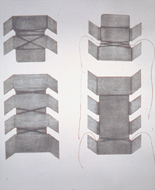
"Box Pattern II", 1976, collagraph print,
30 x 26 inches
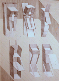
"Cradle Forms", 1978, graphite on ragboard
and collage, 40 x 32 inches
Collection: De Paul University Art Museum,
Chicago, Gift of Mary and John Gedo
And early works in corrugated cardboard (done roughly between 1978 and 1980;see Artemisia Gallery installation with drawn surface embellishment, remain intriguing. Projecting from the wall or standing on the floor, their odd familiarity heightens their strangeness. Things are literally askew, forms pointed in odd directions, planes intersecting for weird purpose. They seem stoic and vulnerable all at once, as if the flat armor-like planes of their surfaces only symbolically protect the mysterious interior space these planes create. This phenomenon occurs because the system for creating the illusion of space in the drawings has also been utilized in creating the sculptures which exist in actual space. Yet, of course, the three-dimensional version replicates the isometric drawing only when viewed from one particular spot—the vantage point depicted in the drawing (see Leaning Lookout p.17).

"Leaning Lookout", 1978, corrugated board,
colored pencil, crayon, 105 x 65 x 45 inches
The cardboard works led organically into a series called “Samurai,” which Simpson showed at the Phyllis Kind Gallery, legendary for exhibiting the Chicago Imagists, in November of 1983. The work Ribbed Kimono of 1980, constructed from gray archival cardboard, nonetheless might be said to be the progenitor of the Samurai series. The majority of the earlier brown cardboard pieces rely on the wall as well as the floor for support. In the tradition of modernist sculpture, Ribbed Kimono is freestanding, devoid of base or pedestal, it stands plainly on the floor, and at fifty-nine inches high is roughly human scale. The Samurai works (she made ten Samurais) are all freestanding, formidable presences, much like their warrior namesakes.
Interestingly, Simpson was eager to show her process in this Phyllis Kind Gallery exhibition. The show opened with a juxtaposing of Samurai 1 (1981) with its pattern, so to speak. A framed collagraph—traditionally a type of print made from a board or 'plate' onto which materials are collaged, thus forming a relief that is inked and printed onto paper—hung on the wall with the constructed piece standing to one side. In this case, the plates are simply cut shapes of embossed paper. The collagraph clearly shows each segment that made up the work, with score lines and slots—even written instructions—indicating how it would come together. With the exception of Samurai I, which adhered the same paper plates of the collagraph onto rag board to make up the sculpture, the other works in the series are constructed of medium density fiberboard or MDF. The sturdier material allowed the investigation of new forms. Samurai 5 (1983) and Samurai 6 (1983) feature curved elements, harkening back to Samurai 1 and looking to the future. As well, while the crayon-rubbed surface of corrugated cardboard revealed the fluted interior structure of the material, MDF presents a solid, rigid face. To transfer the pattern for a sculpture onto MDF, Simpson used a router; the incised marks left behind by this tool became part of the surface, creating its own distinctive pattern. In this way, surface decoration continued to intimately connect with the nature of the material chosen to realize the sculptures.
Although Simpson often creates works that are inspired by things that decorate or accessorize the body, her interest cannot really be said to be with the human form itself. Her interest lies more with clothing that arranges the body rather than the opposite, clothing that reveals or enhances the natural shape of the body. So while the clothing styles from which she has drawn inspiration may seem disparate, they are in fact all exaggerated costumes that cause the body to be shaped and presented. Japanese clothing, the source for Ribbed Kimono and the various Samurai works, arranges the body into flat planes and billowing volumes much like Elizabethan garb that inspired Court Lady (1984) or the dresses of the Infanta Maria Teresa as captured by Velázquez, reflected in Dress Frame, 1987.
Thus the shaping of the body by dress links the Samurai series and the series that directly follows, which Simpson terms “Historical.” The interior spaces open up and become even more pronouncedly vulnerable in this series which features diaphanous fabric to define outer planes and wood as the 'lines' that form the infrastructure. Presented at Illinois State Museum's Chicago Gallery in 1988, the Historical series had its genesis in Court Lady (1984) which is sourced to a vintage drawing of a side view of an Elizabethan-era dress that seems to have a built-in ruffled tutu. Drawing for Court Lady is particularly instructive. Composed of two flat planar sections when disassembled, Court Lady forms a continuous curvilinear structure when reassembled. The curving technique is derived from tambours—a technique in woodworking wherein strips of wood are glued onto a fabric to created such items as the roll top on a roll-top desk. By using this technique, the planar construction of the early works gives way to increasingly volumetric forms.
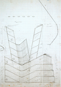
"Drawing for Court Lady", 1984, graphite on
vellum graph paper, detail: 33 x 24 inches
The Historical series shows increasingly ambitious efforts to play with structure and balance, as in Underskirt (1986), based on the exaggerated pannier style popular in Europe in the latter half of the 1600s. Its intricate planes seemingly traces bilateral symmetry, while in fact each side as it slants away from its opposite also slants outward in space at a 45 degree angle. This frequent feature of Simpson's work results in an asymmetrical orientation and a twisting and skewing of the whole. The relationship of these exaggerated undergarments to Simpson's creations is more easily recognized in Dress Frame (1987) where surface pattern becomes minimal and structure predominates.
Simpson's sculptures have always been generally human scale, and her next several series deal more directly with the body insofar as they were inspired by hats—“Headgear” 1991–95; clothing details—“Sleeves” 1997–99; and “Aprons” 2001–2005 which included a work that took off from the male version of the apron, the tool belt. The works in these series include some of Simpson's most recognizable translations: a wide-brimmed Asian hat, Boshi (1995); a Bowler (1994–95); bonnets such as Mesh Bonnet II and Amish Bonnet, both of 1992, but also some of her most abstracted and unrecognizable translations, Sleeve-Sling (1997) or Apron V (2002), where an aluminum frame articulates space around a central column made up of white vinyl mesh and linen.
With these series, Simpson's selection of materials is expanded, designed to meet the needs of each particular piece, whether it be leather (as in the extraordinary Apron X [2005] which resembles an Art Deco chest of drawers but is based on a billowing, flirty circa 1940 apron that the artist came across in reproduction), faux fur, perforated steel, or brass tubes or mesh. But in all these works, the materials themselves take the place of the surface decoration of the cardboard works and the Kimono and Samurai pieces of her early production.
The series “Aprons” is surprising as it takes the form of the most recognizably body-like shapes of Simpson's work to date. Apron III (2001) wears a peplum of linoleum which has deep autobiographical meaning for the artist. She discovered it in an attic upstairs in her 1920s-era home and it evoked memories of her childhood kitchen of the late 1940s; Apron VI (2003), shown in window 4 on page 75, mimics the extreme shoulder treatment of an Yves Saint Laurent creation, Pagoda Ensemble (1980), as ensconced in the Costume Institute at the Metropolitan Museum of Art in New York.
Her next series, “Cover-Ups,” stripped down her often intricate forms into much more straightforward representations. Vest (Red/Gray, (2008) is crisp, two-sided, and deceptively simple. If one were to imagine deconstructing the piece, (or to examine the drawing) one can see the work is made up of two flat pieces that wrap around one another. Unlike earlier works, there is no armature which supports a surface; the armature and surface are one in the same. The decorative quality is enhanced in this particular work with its gleaming white surfaces reminiscent of 1930s-era enamelware enhanced by a simple border of red on one side and a bluish-gray on the other. Both sides seem the same; only on close examination does one realize the red side is smooth and continuous and the gray side made up of two parts, one curving around from the red side. Here as well the platform on which it stands is integrated into the piece. Bib-brass, of 2006 has a similar make-up; simple planes wrapped together to create the three-dimensional form which shimmers with the seductive appeal of burnished brass. It looks almost like an elegant cocktail dress, but for the humorous 'trough' at the bottom of the structure for catching errant bits of food which would make for a very utilitarian bib indeed.
This simple, but more sophisticated reimagining of forms is the platform for the next project, Window Dressing, which contextualized seven works—Bib-brass (2006; Window 1, p.72), Bib- dots (2006; Window 2, p.73), Pinafore (1987; Window 3, p.74), Apron VI (2003; Window 4, p.75), Apron II (2000; Window 5, p.76), Vee of 1999 and Bib-deco of 2007 (both in Window 6, p.77) into window displays at the Racine Art Museum, Wisconsin. The Racine Art Museum, a former department store provided exactly the right showcase for Simpson's concept of evoking merchandise display windows of the Art Deco period as well as paying homage to the window- dressers of the 1920s and '30s. An Art Deco gate design found in the 96th Street subway station in New York inspired background elements for Window 3, which featured Pinafore. The Manual of Show Window Backgrounds for Mercantile Display by E.O. Burdg published in 1925 provided source material for Window 4, which featured Apron VI.

Gate, 96th street subway station, NYC
Source for Window 3
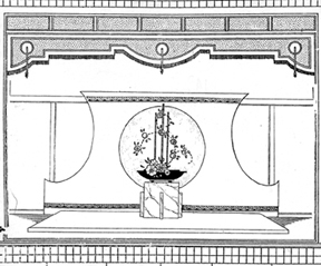
The Manual of Show Window Backgrounds
for Mercantile Display, 1925, E.O.Burdg.
Courtesy, John Crerar Library, University of
Chicago: Source for Window 4
This expansion from presenting discrete objects, albeit in well-planned and dynamic groupings to embedding an object in an environment presents a new challenge. The fixed viewpoint allowed by the window itself controls and directs the gaze, adding another plane, so to speak, to the isometric nature of Simpson's entire project. With earlier works, one could choose to align his or her viewing with that presented in the isometric drawing (if provided) and “fix” a vantage point. With this project, the volumetric forms indeed become flattened by dint of being embedded in an essentially two-dimensional, highly graphical setting.
Diane Simpson's extraordinary clarity of vision and her exquisite 'shape-sifting' result in works that are unique and unmistakable. Meldings of form and volume, structure and surface, abstraction and figuration, essential materials and decorative embellishments, intellectual rigor and warm-hearted playfulness, her works occupy a unique position in contemporary sculpture and the endeavor to capture the vastness of nature and human experience in vital forms.
Lynne Warren, Chicago, 2010
As incontrovertible as it is that our world exists in three physical dimensions, our social and cultural worlds communicate largely through two-dimensional imagery. Whether in the form of the printed page, or images on video or movie screens, or manifestations from snapshots to signs and billboards to diagrams to slides (traditional or PowerPoint), two-dimensional representations are everywhere. Navigating the world necessitates constant translation of the two-dimensional into three, from interpreting photographs to translating GPS maps so that one might maneuver a car through the real environment.
The translation of the flat into a volume has long been an activity of artists, especially as the twentieth century unfolded with sculptural investigations of innovators such as the Constructivists like Tatlin, or Alexander Calder, Jean Arp, David Smith, and many others. In the more recent history of contemporary art, a noticeable tendency has been the celebration of the flat precisely because of the ubiquity of two-dimensional representations that make up our world. From the 'Superflat' philosophy of Takashi Murakami to the cut-outs of Julian Opie, forms are simplified, even abstracted, but in a cartoonish or even childlike way, to create pleasing imagery. Most viewers can easily recognize the translational process of two dimensions into three. As exemplified by Roy Lichtenstein's three-dimensional—but essentially planar— house sculptures, the final works have clear and unmistakable connections to their two-dimensional sources.
Diane Simpson has long been on this aesthetic playing-field. Yet Simpson takes this process of translating from two dimensions into three a further step. She starts with volumetric objects from the world, translates them into two dimensions by means of elegant and intricate drawings (essentially plans for the sculptures), and then creates a volumetric object as the final work. And in the process of translation between dimensional manifestations, it might be said she is a 'shape- sifter,' for Simpson sifts through a wide range of sources—the contours of a thatched roof, the folds of leather that make up tool belts, the shapes traced by the delicate laces and fabrics of traditional bonnets—to seize upon her essential forms. In examining one of Simpson's sources, it is obvious that the forms of the sculpture which it inspired reside there. Yet, without the artist having seized upon and translated those forms, it is doubtful any viewer would look at, say a vintage dress mannequin, and notice the articulation of forms this utilitarian item carries in it in any way nears the graceful flow of lines that make up Apron V of 2002.
Simpson's career now spans three decades, yet has had a formal consistency that allows one both to learn and appreciate her process while greatly enjoying its iterations, which, as witnessed by this current exhibition, are ceaselessly captivating and satisfying. In understanding this progression, it is helpful to go back to an early 'inspirational image' for the artist, The Shrine at Medina, made in Ottoman Turkey in the late 17th to early 18th century. This painting shows a bird's-eye view of the walled complex, but flattened into planes strange and awkward to the Western eye, formed as it has been by classical one-point perspective. In today's parlance, this type of rendering is called isometric drawing, a type of graphic representation that takes the form of axonometric projection, a method of visually representing three-dimensional objects in two dimensions in which the three coordinate axes appear equally foreshortened and the angles between any two of them are 120 degrees. This sort of projection or drawing technique is most commonly used in engineering and technical drawings.

"The Shrine At Medina",
late 17th-18thcentury, Ottoman Art
At the School of the Art Institute of Chicago where she received both her BFA and MFA, Simpson studied painting, drawing, and printmaking. Her final year of graduate school in the painting department found her producing not paintings, but drawings and prints using isometric perspective, which naturally led to suggestions that she construct the two-dimensional representations. To this day pencil and paper remain key tools for the working out of forms to translate into three dimensions.

"Box Pattern II", 1976, collagraph print,
30 x 26 inches

"Cradle Forms", 1978, graphite on ragboard
and collage, 40 x 32 inches
Collection: De Paul University Art Museum,
Chicago, Gift of Mary and John Gedo
And early works in corrugated cardboard (done roughly between 1978 and 1980;see Artemisia Gallery installation with drawn surface embellishment, remain intriguing. Projecting from the wall or standing on the floor, their odd familiarity heightens their strangeness. Things are literally askew, forms pointed in odd directions, planes intersecting for weird purpose. They seem stoic and vulnerable all at once, as if the flat armor-like planes of their surfaces only symbolically protect the mysterious interior space these planes create. This phenomenon occurs because the system for creating the illusion of space in the drawings has also been utilized in creating the sculptures which exist in actual space. Yet, of course, the three-dimensional version replicates the isometric drawing only when viewed from one particular spot—the vantage point depicted in the drawing (see Leaning Lookout p.17).

"Leaning Lookout", 1978, corrugated board,
colored pencil, crayon, 105 x 65 x 45 inches
The cardboard works led organically into a series called “Samurai,” which Simpson showed at the Phyllis Kind Gallery, legendary for exhibiting the Chicago Imagists, in November of 1983. The work Ribbed Kimono of 1980, constructed from gray archival cardboard, nonetheless might be said to be the progenitor of the Samurai series. The majority of the earlier brown cardboard pieces rely on the wall as well as the floor for support. In the tradition of modernist sculpture, Ribbed Kimono is freestanding, devoid of base or pedestal, it stands plainly on the floor, and at fifty-nine inches high is roughly human scale. The Samurai works (she made ten Samurais) are all freestanding, formidable presences, much like their warrior namesakes.
Interestingly, Simpson was eager to show her process in this Phyllis Kind Gallery exhibition. The show opened with a juxtaposing of Samurai 1 (1981) with its pattern, so to speak. A framed collagraph—traditionally a type of print made from a board or 'plate' onto which materials are collaged, thus forming a relief that is inked and printed onto paper—hung on the wall with the constructed piece standing to one side. In this case, the plates are simply cut shapes of embossed paper. The collagraph clearly shows each segment that made up the work, with score lines and slots—even written instructions—indicating how it would come together. With the exception of Samurai I, which adhered the same paper plates of the collagraph onto rag board to make up the sculpture, the other works in the series are constructed of medium density fiberboard or MDF. The sturdier material allowed the investigation of new forms. Samurai 5 (1983) and Samurai 6 (1983) feature curved elements, harkening back to Samurai 1 and looking to the future. As well, while the crayon-rubbed surface of corrugated cardboard revealed the fluted interior structure of the material, MDF presents a solid, rigid face. To transfer the pattern for a sculpture onto MDF, Simpson used a router; the incised marks left behind by this tool became part of the surface, creating its own distinctive pattern. In this way, surface decoration continued to intimately connect with the nature of the material chosen to realize the sculptures.
Although Simpson often creates works that are inspired by things that decorate or accessorize the body, her interest cannot really be said to be with the human form itself. Her interest lies more with clothing that arranges the body rather than the opposite, clothing that reveals or enhances the natural shape of the body. So while the clothing styles from which she has drawn inspiration may seem disparate, they are in fact all exaggerated costumes that cause the body to be shaped and presented. Japanese clothing, the source for Ribbed Kimono and the various Samurai works, arranges the body into flat planes and billowing volumes much like Elizabethan garb that inspired Court Lady (1984) or the dresses of the Infanta Maria Teresa as captured by Velázquez, reflected in Dress Frame, 1987.
Thus the shaping of the body by dress links the Samurai series and the series that directly follows, which Simpson terms “Historical.” The interior spaces open up and become even more pronouncedly vulnerable in this series which features diaphanous fabric to define outer planes and wood as the 'lines' that form the infrastructure. Presented at Illinois State Museum's Chicago Gallery in 1988, the Historical series had its genesis in Court Lady (1984) which is sourced to a vintage drawing of a side view of an Elizabethan-era dress that seems to have a built-in ruffled tutu. Drawing for Court Lady is particularly instructive. Composed of two flat planar sections when disassembled, Court Lady forms a continuous curvilinear structure when reassembled. The curving technique is derived from tambours—a technique in woodworking wherein strips of wood are glued onto a fabric to created such items as the roll top on a roll-top desk. By using this technique, the planar construction of the early works gives way to increasingly volumetric forms.

"Drawing for Court Lady", 1984, graphite on
vellum graph paper, detail: 33 x 24 inches
The Historical series shows increasingly ambitious efforts to play with structure and balance, as in Underskirt (1986), based on the exaggerated pannier style popular in Europe in the latter half of the 1600s. Its intricate planes seemingly traces bilateral symmetry, while in fact each side as it slants away from its opposite also slants outward in space at a 45 degree angle. This frequent feature of Simpson's work results in an asymmetrical orientation and a twisting and skewing of the whole. The relationship of these exaggerated undergarments to Simpson's creations is more easily recognized in Dress Frame (1987) where surface pattern becomes minimal and structure predominates.
Simpson's sculptures have always been generally human scale, and her next several series deal more directly with the body insofar as they were inspired by hats—“Headgear” 1991–95; clothing details—“Sleeves” 1997–99; and “Aprons” 2001–2005 which included a work that took off from the male version of the apron, the tool belt. The works in these series include some of Simpson's most recognizable translations: a wide-brimmed Asian hat, Boshi (1995); a Bowler (1994–95); bonnets such as Mesh Bonnet II and Amish Bonnet, both of 1992, but also some of her most abstracted and unrecognizable translations, Sleeve-Sling (1997) or Apron V (2002), where an aluminum frame articulates space around a central column made up of white vinyl mesh and linen.
With these series, Simpson's selection of materials is expanded, designed to meet the needs of each particular piece, whether it be leather (as in the extraordinary Apron X [2005] which resembles an Art Deco chest of drawers but is based on a billowing, flirty circa 1940 apron that the artist came across in reproduction), faux fur, perforated steel, or brass tubes or mesh. But in all these works, the materials themselves take the place of the surface decoration of the cardboard works and the Kimono and Samurai pieces of her early production.
The series “Aprons” is surprising as it takes the form of the most recognizably body-like shapes of Simpson's work to date. Apron III (2001) wears a peplum of linoleum which has deep autobiographical meaning for the artist. She discovered it in an attic upstairs in her 1920s-era home and it evoked memories of her childhood kitchen of the late 1940s; Apron VI (2003), shown in window 4 on page 75, mimics the extreme shoulder treatment of an Yves Saint Laurent creation, Pagoda Ensemble (1980), as ensconced in the Costume Institute at the Metropolitan Museum of Art in New York.
Her next series, “Cover-Ups,” stripped down her often intricate forms into much more straightforward representations. Vest (Red/Gray, (2008) is crisp, two-sided, and deceptively simple. If one were to imagine deconstructing the piece, (or to examine the drawing) one can see the work is made up of two flat pieces that wrap around one another. Unlike earlier works, there is no armature which supports a surface; the armature and surface are one in the same. The decorative quality is enhanced in this particular work with its gleaming white surfaces reminiscent of 1930s-era enamelware enhanced by a simple border of red on one side and a bluish-gray on the other. Both sides seem the same; only on close examination does one realize the red side is smooth and continuous and the gray side made up of two parts, one curving around from the red side. Here as well the platform on which it stands is integrated into the piece. Bib-brass, of 2006 has a similar make-up; simple planes wrapped together to create the three-dimensional form which shimmers with the seductive appeal of burnished brass. It looks almost like an elegant cocktail dress, but for the humorous 'trough' at the bottom of the structure for catching errant bits of food which would make for a very utilitarian bib indeed.
This simple, but more sophisticated reimagining of forms is the platform for the next project, Window Dressing, which contextualized seven works—Bib-brass (2006; Window 1, p.72), Bib- dots (2006; Window 2, p.73), Pinafore (1987; Window 3, p.74), Apron VI (2003; Window 4, p.75), Apron II (2000; Window 5, p.76), Vee of 1999 and Bib-deco of 2007 (both in Window 6, p.77) into window displays at the Racine Art Museum, Wisconsin. The Racine Art Museum, a former department store provided exactly the right showcase for Simpson's concept of evoking merchandise display windows of the Art Deco period as well as paying homage to the window- dressers of the 1920s and '30s. An Art Deco gate design found in the 96th Street subway station in New York inspired background elements for Window 3, which featured Pinafore. The Manual of Show Window Backgrounds for Mercantile Display by E.O. Burdg published in 1925 provided source material for Window 4, which featured Apron VI.

Gate, 96th street subway station, NYC
Source for Window 3

The Manual of Show Window Backgrounds
for Mercantile Display, 1925, E.O.Burdg.
Courtesy, John Crerar Library, University of
Chicago: Source for Window 4
This expansion from presenting discrete objects, albeit in well-planned and dynamic groupings to embedding an object in an environment presents a new challenge. The fixed viewpoint allowed by the window itself controls and directs the gaze, adding another plane, so to speak, to the isometric nature of Simpson's entire project. With earlier works, one could choose to align his or her viewing with that presented in the isometric drawing (if provided) and “fix” a vantage point. With this project, the volumetric forms indeed become flattened by dint of being embedded in an essentially two-dimensional, highly graphical setting.
Diane Simpson's extraordinary clarity of vision and her exquisite 'shape-sifting' result in works that are unique and unmistakable. Meldings of form and volume, structure and surface, abstraction and figuration, essential materials and decorative embellishments, intellectual rigor and warm-hearted playfulness, her works occupy a unique position in contemporary sculpture and the endeavor to capture the vastness of nature and human experience in vital forms.
Lynne Warren, Chicago, 2010